Project Context
Project
Context
Project context
Client: Nesta - Centre for Collective Intelligence
Role: Product Designer/ Visual Designer
Timeline: 4 months
The Centre for Collective Intelligence Design team at Nesta works to transform how society collaborates by breaking down barriers to participation and rebuilding trust between people and institutions. Using technology, AI, arts, and design, they scale public engagement to be faster, more inclusive, and impactful through digital participation tools and innovative engagement processes.
As a Designer on the team, I was tasked with redesigning the onboarding experience of their public engagement platform, Zeitgeist. What began as an effort to refine the user experience and improve the platform’s visual design eventually evolved into a rebrand focused on making the platform more approachable and accessible by introducing a cleaner, friendlier design system that helps users feel comfortable navigating and participating.
Client: Nesta - Centre Collective for Intelligence
Role: Product Designer/ Visual Designer
Timeline: 4 months
The Centre for Collective Intelligence Design team at Nesta works to transform how society collaborates by breaking down barriers to participation and rebuilding trust between people and institutions. Using technology, AI, arts, and design, they scale public engagement to be faster, more inclusive, and impactful through digital participation tools and innovative engagement processes.
As a Designer on the team, I was tasked with redesigning the onboarding experience of their public engagement platform, Zeitgeist. What began as an effort to refine the user experience and improve the platform’s visual design eventually evolved into a rebrand focused on making the platform more approachable and accessible by introducing a cleaner, friendlier design system that helps users feel comfortable navigating and participating.
Challenge
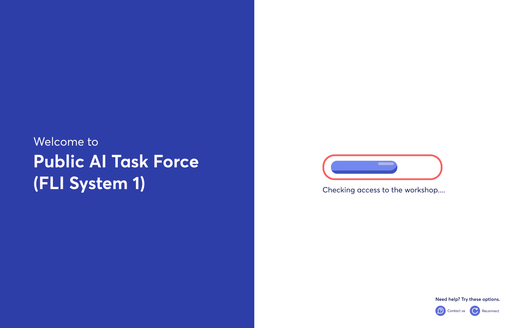
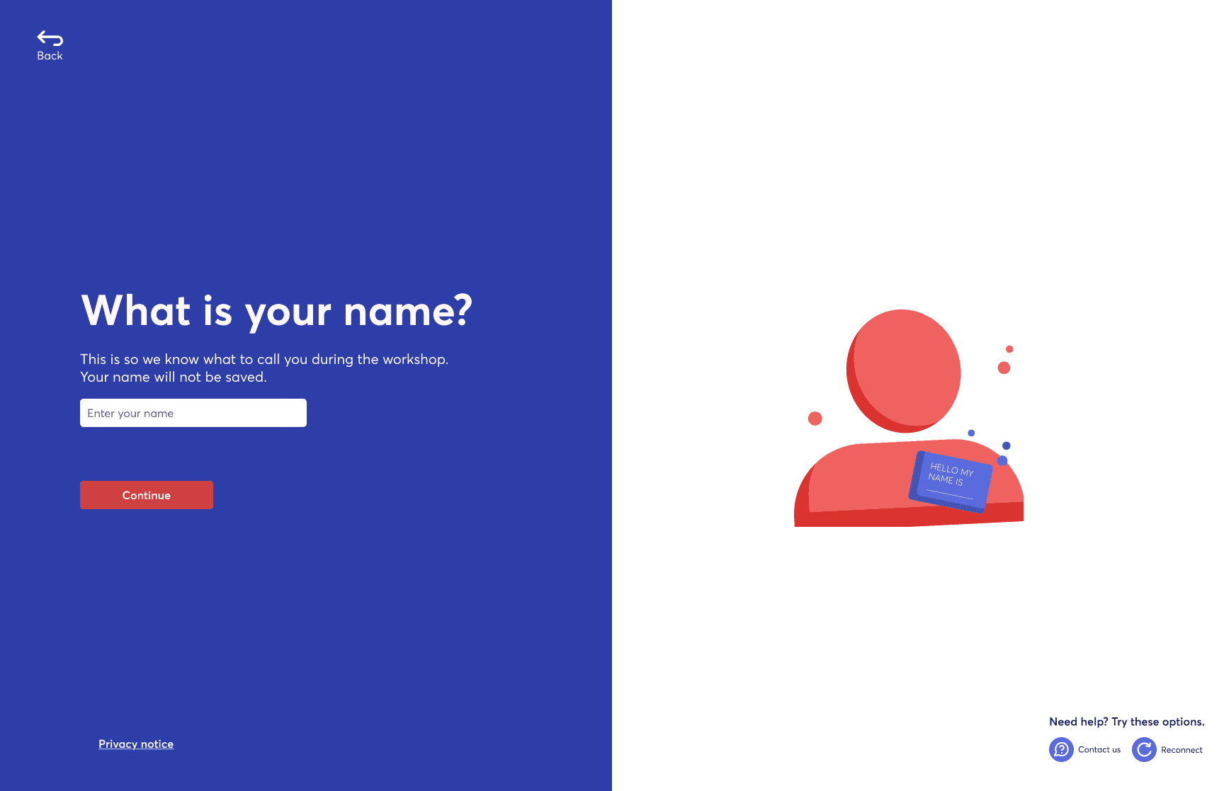
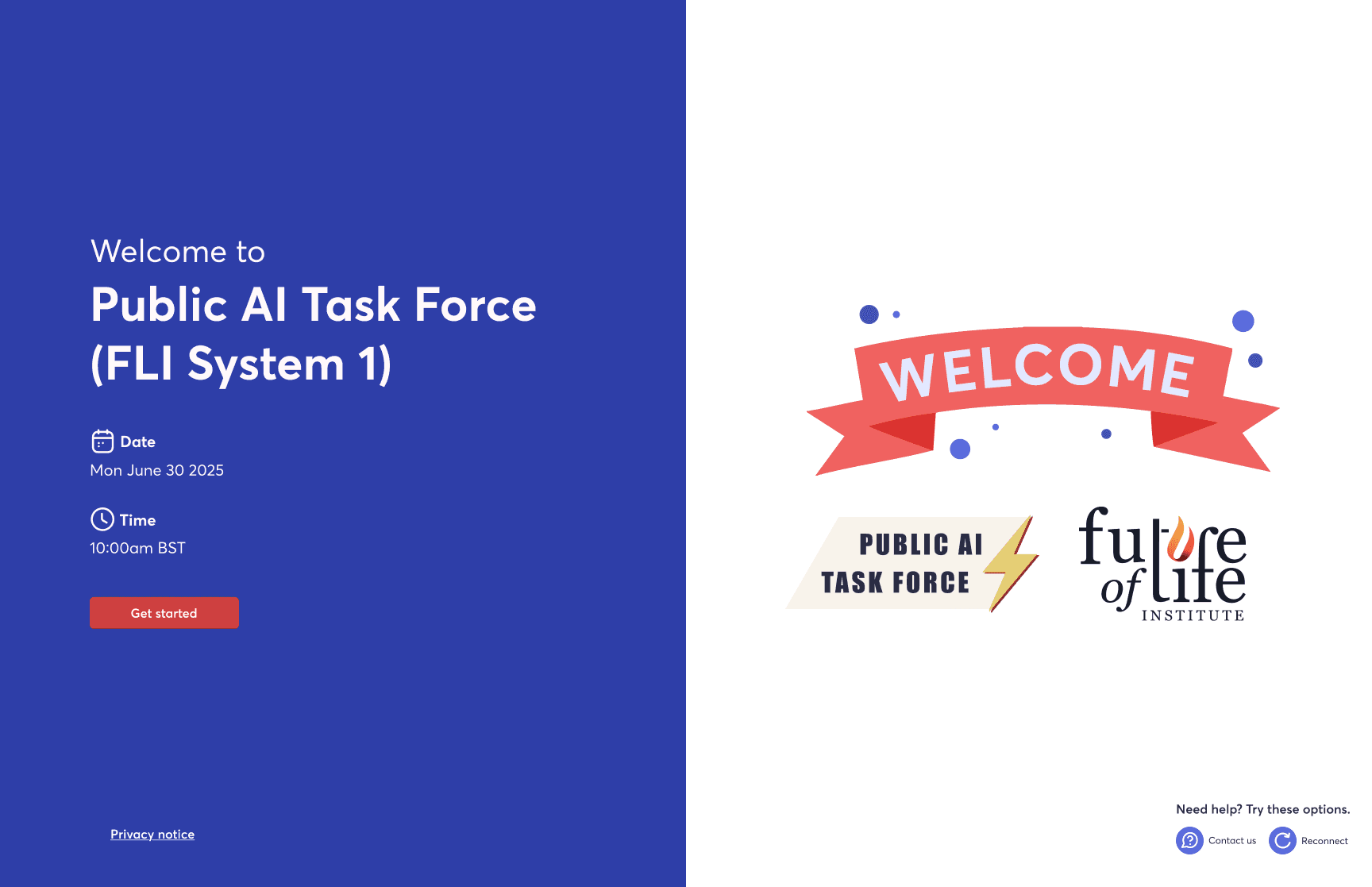
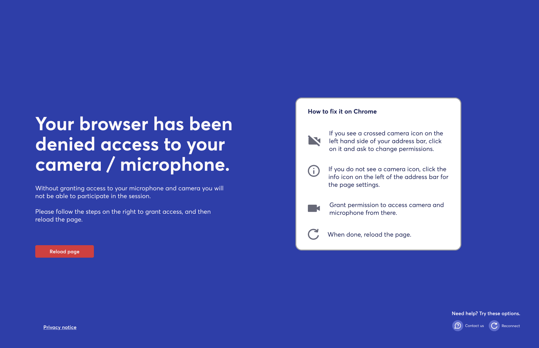
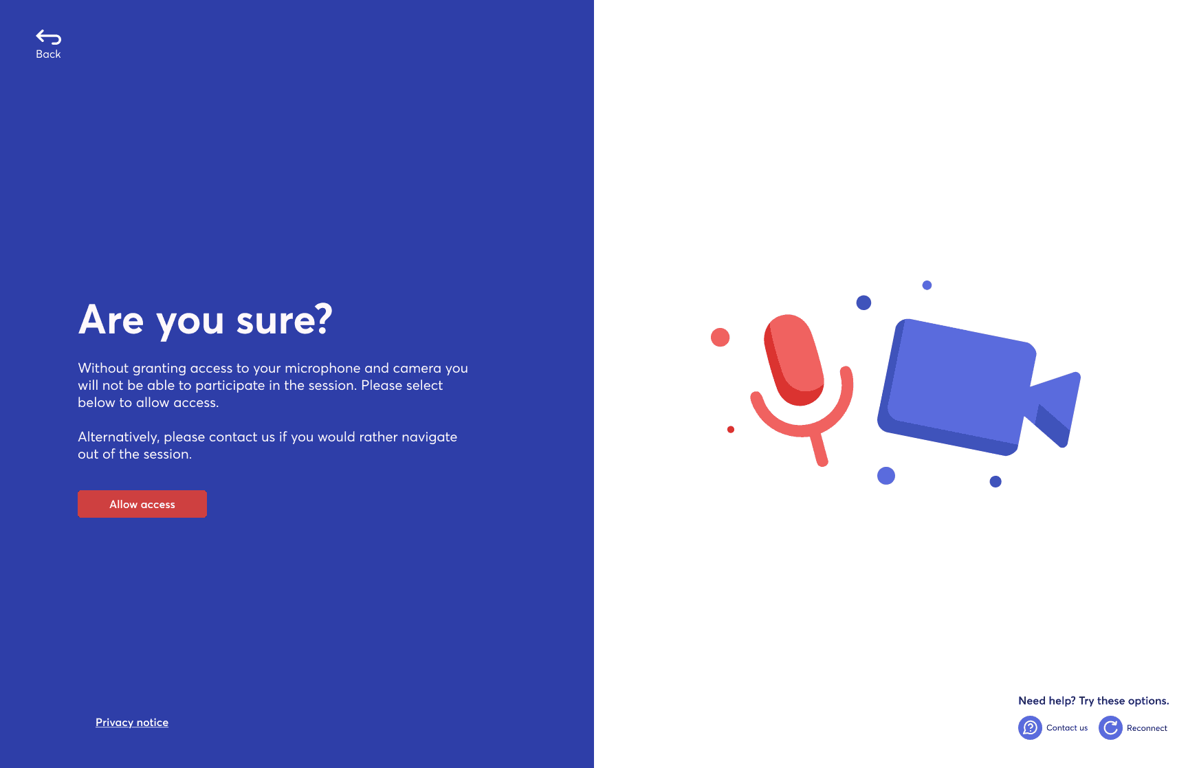
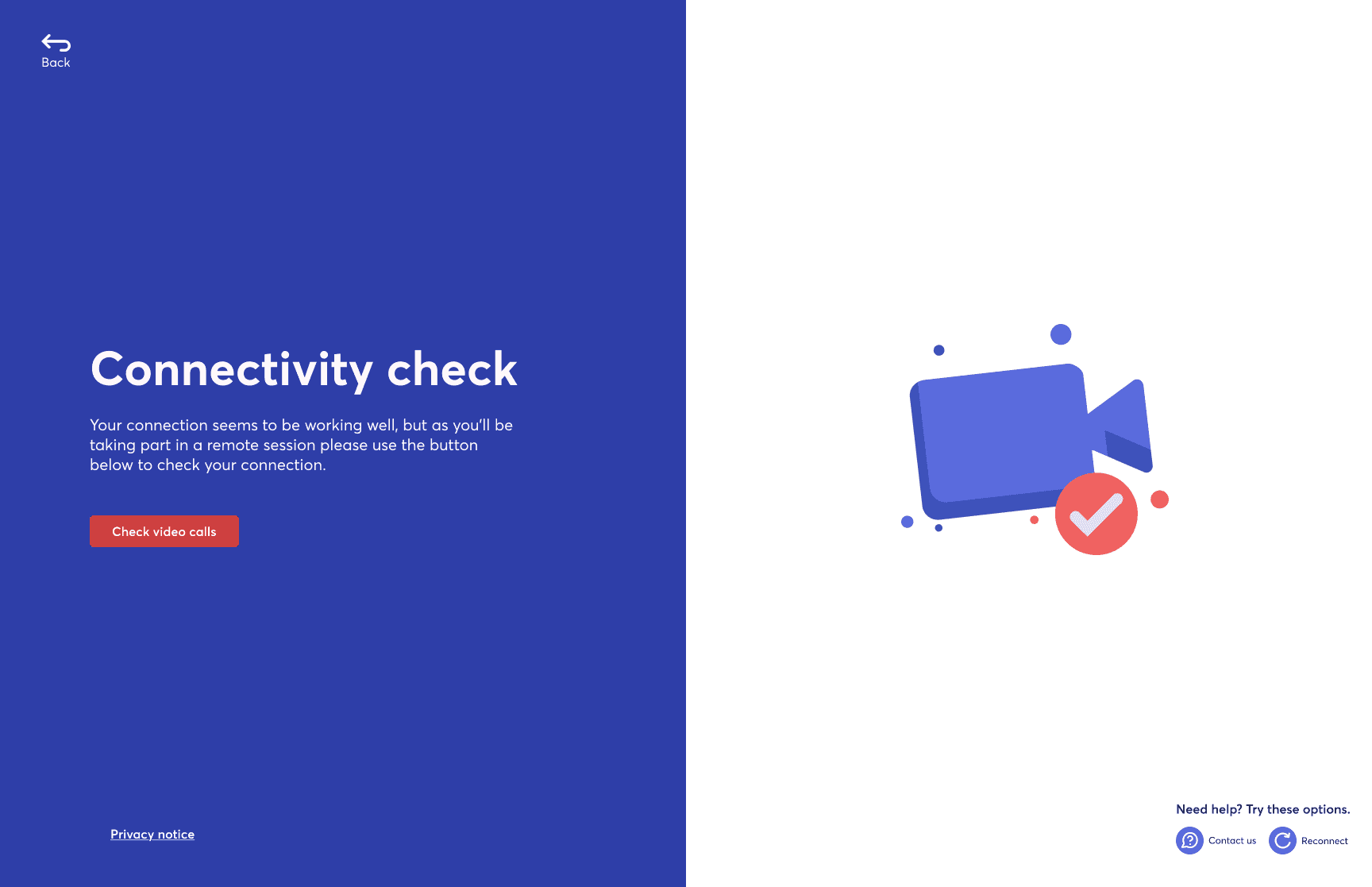
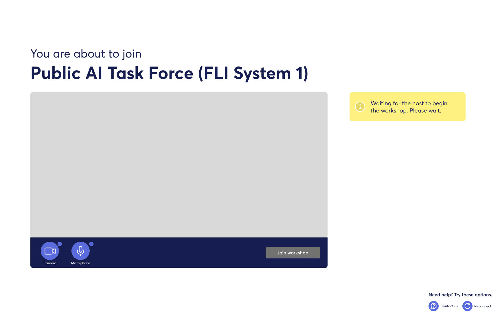
Zeitgeist's onboarding experience introduces unnecessary friction, with multiple steps, loading states, and permissions making the journey feel overly technical. Visually, it lacks cohesion. The branding is understated, and the colour system does little to guide or orient users.
As a result, the experience feels fragmented rather than welcoming. For a platform centered on collaboration, the first interaction should be visually clear, cohesive, and intuitive with a strong branding and purposeful colour to create a sense of ease and direction from the outset.

Ineffective use of color
The color palette does not clearly signal hierarchy, actions, or system states. Key actions such as joining or continuing are not visually emphasised, while overlays reduce contrast and readability.
Limited guidance and feedback
Users receive little context about what each step means or how long the process will take, which can create uncertainty about where they are in the onboarding journey and what will happen next.
Unclear and uninviting first impression
The opening screens rely on generic visuals and muted overlays that do not clearly communicate the platform’s purpose or identity, weakening brand recognition and the sense of entering a guided experience.
Process
I explored colour directions to define a minimal, accessible, and inviting brand palette, balancing simplicity with a sense of warmth and energy.
Particular focus was placed on the accent colour, ensuring primary actions stand out clearly while maintaining strong contrast and accessibility across the interface.
The final palette of coral, white, and deep blue was selected in collaboration with the design and developer teams. Coral provides a clear, engaging accent for key actions, while deep blue and white create contrast and support a clean, structured visual identity.
I explored several colour directions to create a branding palette that is minimal, accessible, and inviting. The goal was to keep the system simple while ensuring the interface feels approachable and lively without becoming visually overwhelming.
Special attention was given to the accent colour for primary actions, making sure it stands out clearly in the UI so calls to action are easy to identify. All combinations were tested to maintain strong contrast and accessibility while supporting a cohesive and welcoming visual identity.
After exploring several options, we shortlisted a palette of coral, white, and deep blue with input from the design and development teams. Coral works as a clear and inviting accent for key actions, while deep blue and white provide contrast and keep the interface clean and structured.
I explored colour directions to define a minimal, accessible, and inviting brand palette, balancing simplicity with a sense of warmth and energy.
Particular focus was placed on the accent colour, ensuring primary actions stand out clearly while maintaining strong contrast and accessibility across the interface.
The final palette of coral, white, and deep blue was selected in collaboration with the design and developer teams. Coral provides a clear, engaging accent for key actions, while deep blue and white create contrast and support a clean, structured visual identity.
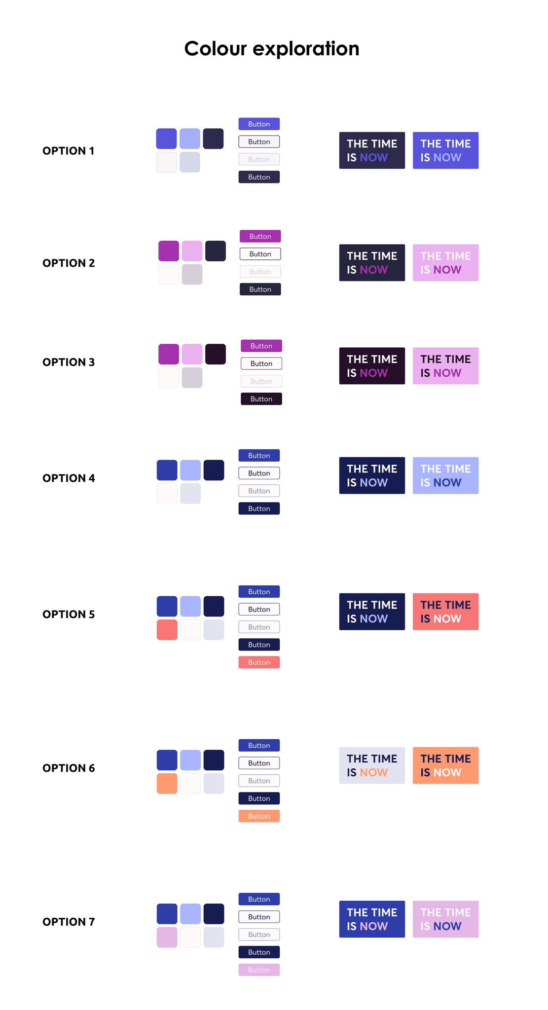


The colours were applied to the existing UIs, experimenting with different shades of the selected palette. They were tested across text, backgrounds, buttons, windows, and other interface elements to understand how they performed within the original layouts.
⚡Plot twist ⚡
Several concerns were raised from the Design and Dev teams about how these colours might be perceived in the interface, especially when compared to common UI conventions used in traditional video calling platforms.
This prompted myself to dig deeper and conduct further research to validate and support our colour choices.
Key Insights
Using coral as an accent colour introduced some risk, as red is typically associated with errors in UI. This required clear guidelines to avoid confusion.
To validate this approach, I reviewed products like HSBC Mobile Banking App and DoorDash. Both use red for primary actions but rely on supporting elements such as icons and clear messaging to indicate errors, rather than colour alone.
This reinforced that coral can work effectively as an accent, provided error states are supported with additional visual and textual cues.


I explored camera and microphone states using familiar UI conventions, creating variations based on patterns from other calling platforms. A red line was used to indicate the off state; despite initial concerns with coral CTAs, the contrast made the meaning clear and unambiguous.
I also refined system message colours, testing shades within the brand palette to better distinguish between success, error, warning, and information states. Icons were paired with each message to reinforce clarity.
Next, these variations will be tested with users to validate assumptions.
Solution
We tested the designs with a diverse group of users aged 30 to 83 to ensure the experience felt clear and accessible across different levels of tech confidence. Overall, the interface was perceived as simple, calm, and easy to follow, with the coral CTA clearly understood.
Feedback highlighted the need for clearer mic and camera permissions, more intuitive controls, stronger error messaging, and more visible support and secondary actions.
These insights informed a final set of guidelines covering colour, CTAs, mic and camera controls, iconography, and illustration. The system was designed to be clear, cohesive, and easy for both developers and designers to use and build on.


Impact & Takeaways
Impact &
Takeaways
The impact of the updated onboarding experience was clear across all ages and levels of tech confidence. A more structured, step-by-step flow, combined with stronger branding and a more approachable visual design, made the experience feel smoother and easier to navigate. This clarity helped build user confidence ahead of participating in workshops.
My key takeaways from this project included developing a deeper understanding of how senior users perceive UI elements and user journeys, the importance of validating challenges raised by other teams, and the value of exploring multiple approaches during ideation.
andrianalaskari.com