
Client
Did you know that, on average, we only wear about 10% of the items in our wardrobes?
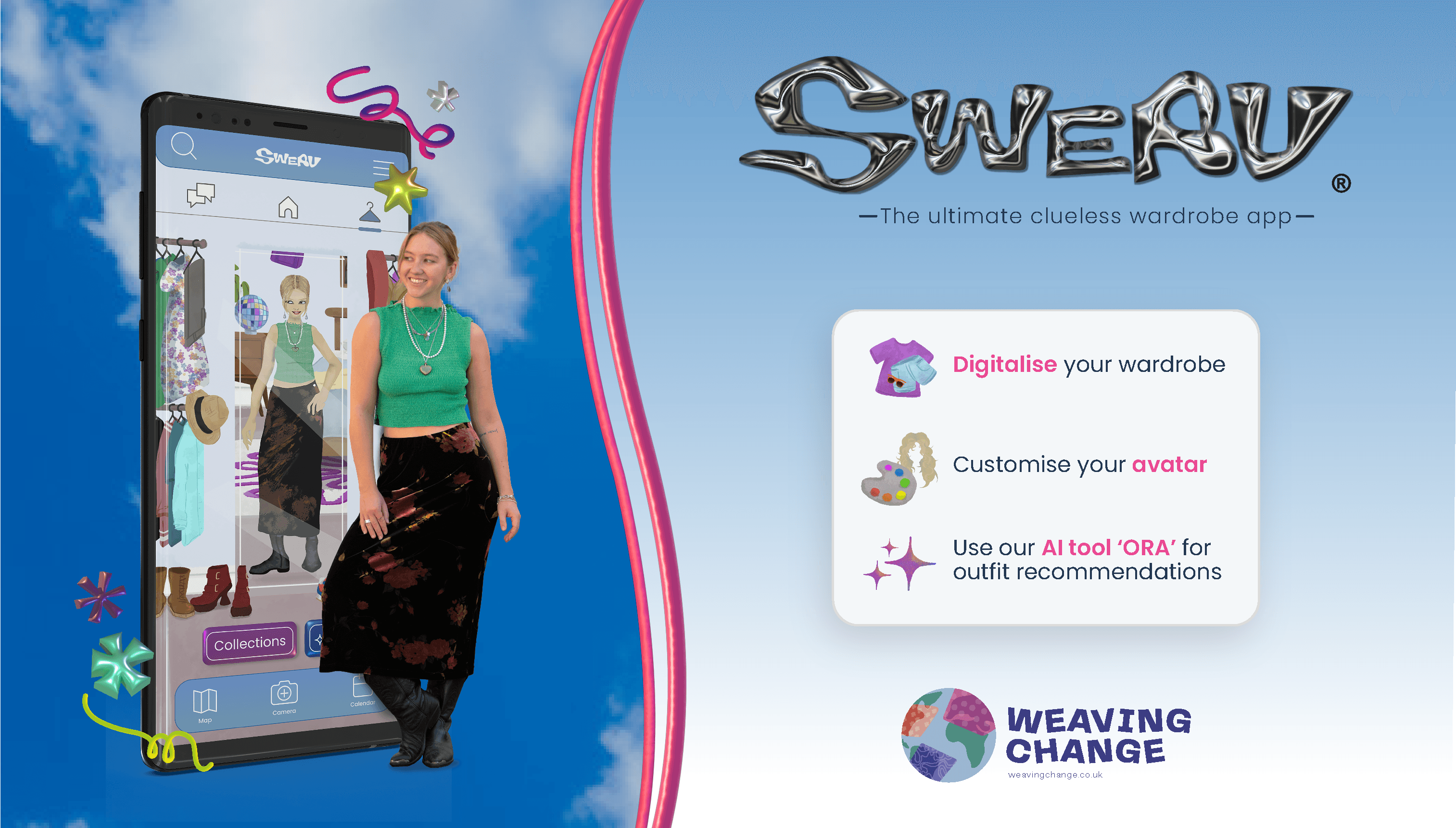
Weaving Change is on a mission to transform how we connect with our clothes, bringing awareness to overconsumption in the fashion industry and slowing down the fast-fashion cycle through engaging workshops and innovative tech solutions. Their latest creation, Swerv, is a cutting-edge wardrobe app designed to help you digitalise your wardrobe, mix and match outfits, and rediscover what you already own—all while having fun! Swerv encourages reusing items, helping you make the most of your wardrobe and inspiring more mindful, sustainable choices in fashion.
Founders: Weronika Stelmach & William Terry-Wright
Project & Role
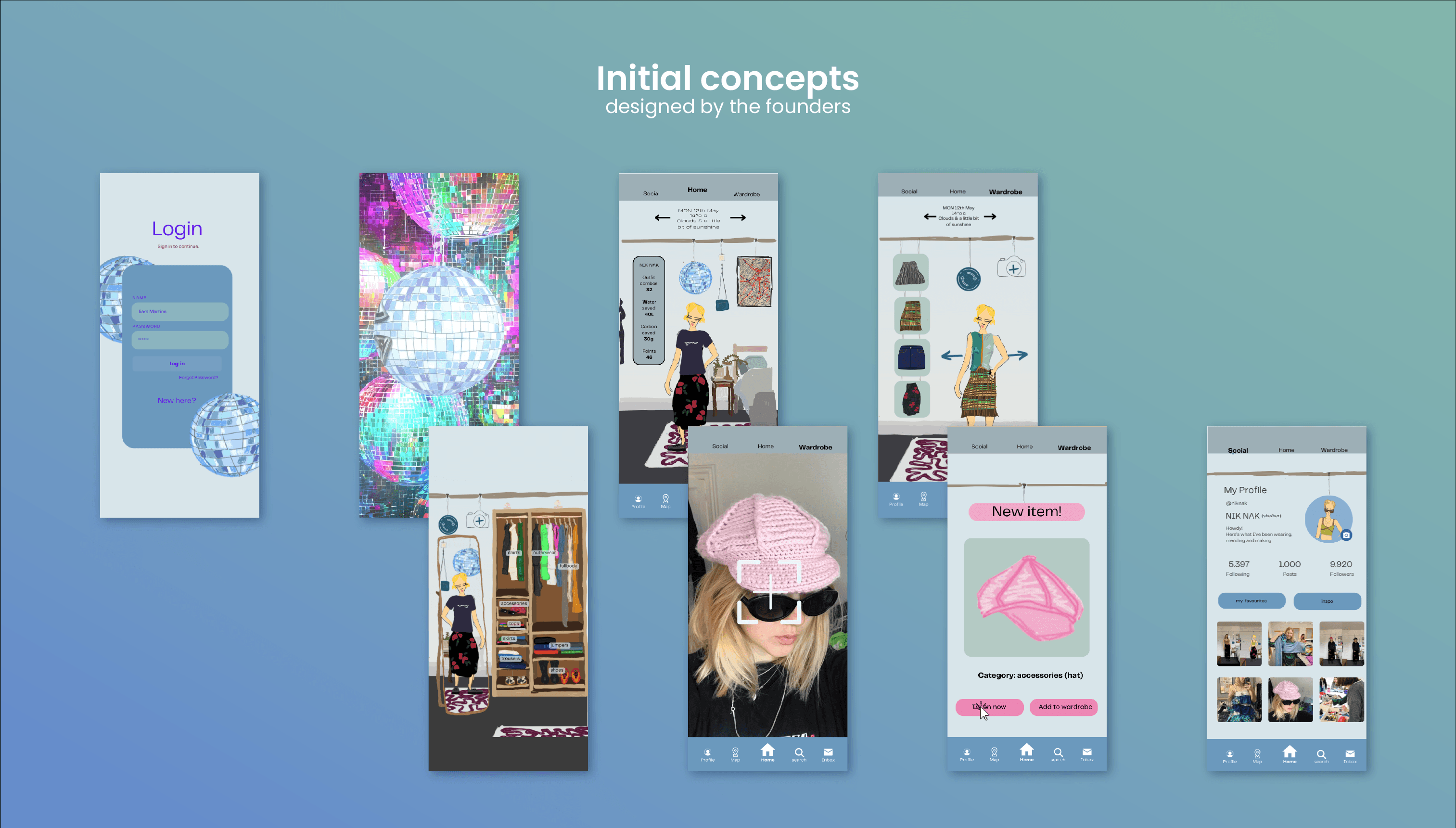
I joined the project at a stage when the Swerv app's UI designs required further refinement. While the founders had loosely developed initial concepts, they were enthusiastic about redesigning the interfaces and shaping Swerv’s visual identity with the support of an experienced designer.
⚡Plot Twist⚡What started as a UI-focused role soon expanded to include illustration, branding, visual communication, and marketing. Utilising my diverse creative expertise, I shaped the visual identities of both Swerv and Weaving Change across digital and print media, evolving my role into that of a Creative Consultant.

Deliverables
✅ Swerv’s Mobile UI Designs - Home, Wardrobe and Social Mode
✅ Swerv’s integrated illustrated assets - including app elements and marketing assets
✅ Weaving Change’s Branding
✅ Weaving Change’s site
✅ Weaving Change’s/ Swerv’s marketing material
✅ Swerv’s Mobile UI Designs - Home, Wardrobe and Social Mode
✅ Swerv’s integrated illustrated assets - including app elements and marketing assets
✅ Weaving Change’s Branding
✅ Weaving Change’s site
✅ Weaving Change’s/ Swerv’s marketing material
Timeline
🗓 4 months
🗓 4 months
Research
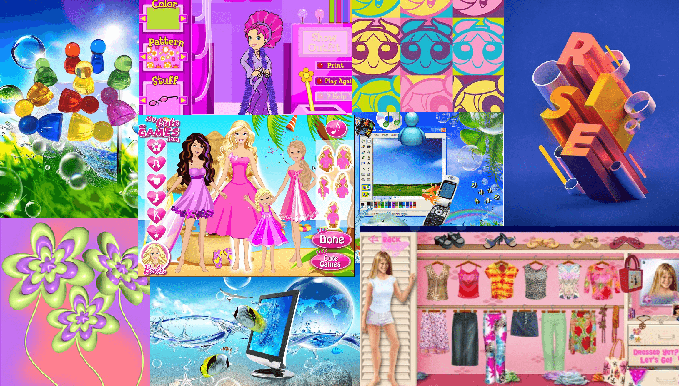
Weronika’s vision for Swerv was to create an interactive, game-based app aimed at Gen Z, inspired by the nostalgic dress-up PC games of the early 2000s. The goal was to make assembling outfits from your wardrobe an exciting experience, allowing you to view your items from a fresh perspective.
With that in mind, I delved deep into researching what makes these types of games so distinctive and memorable by identifying their key characteristics:
Bold, bright colours
Playful, robust fonts
Big, chunky buttons
Catchy background songs and sound effects
Animated transitions
User friendly/ straightforward interfaces
Illustrated environments
Avatars/ characters
Fun customisation
Weronika was also inspired by early 2000s PC visuals and pop art like the iconic, retro cloud backgrounds on the Windows login screens and translucent, balloon-esque elements found in the interfaces.
The greater challenge was striking a balance between maintaining the fun, retro vibe of the designs while ensuring they remained clean and straightforward for accessibility and ease of use.
UI Designs
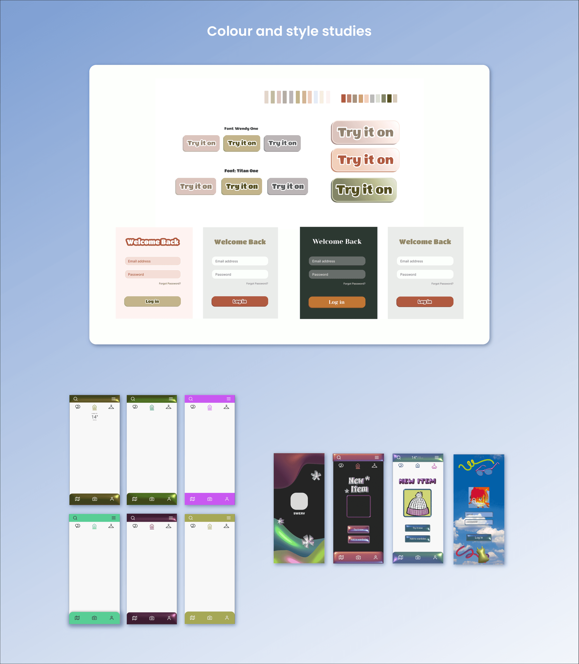
Before designing the UIs on Figma, it was crucial to establish a style and aesthetic identity aligned with the founders’ vision. Working in collaboration with the founders and developers we brainstormed a look that blended sustainability with playful gamification. It was equally important to consider the design constraints highlighted by the developers.
Within the first brainstorming sessions, we quickly realised that a more traditional “sustainable” aesthetic gave off a “Wholefoods” vibe, which did not accurately capture the vibrant and dynamic feel we envisioned for Swerv.
We shifted back to a more vibrant color palette and, after several iterations, finalised the colours for the interfaces. A clean and minimal design was prioritised, allowing the environment and character illustrations developed later in the project to become the focal point.

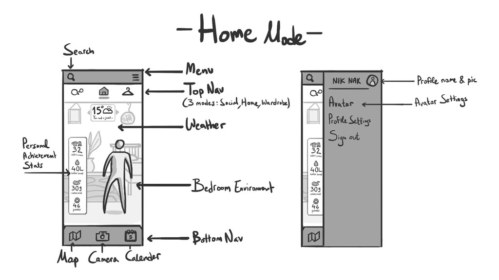
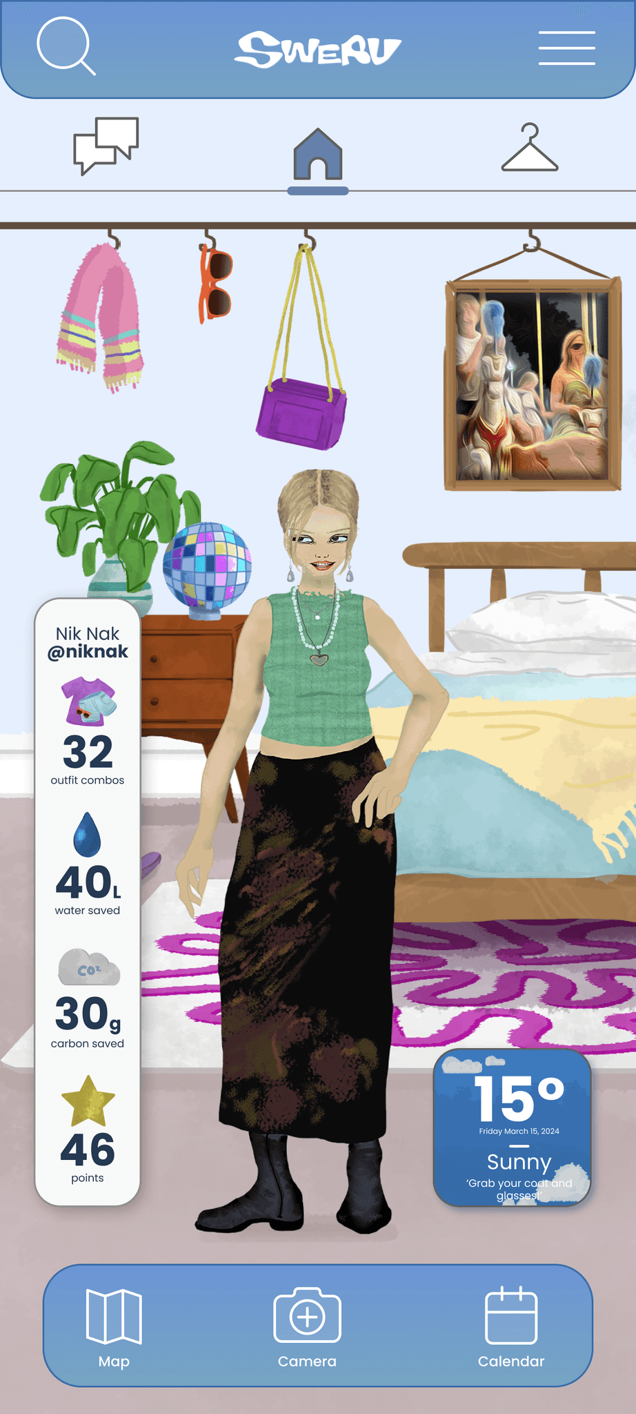
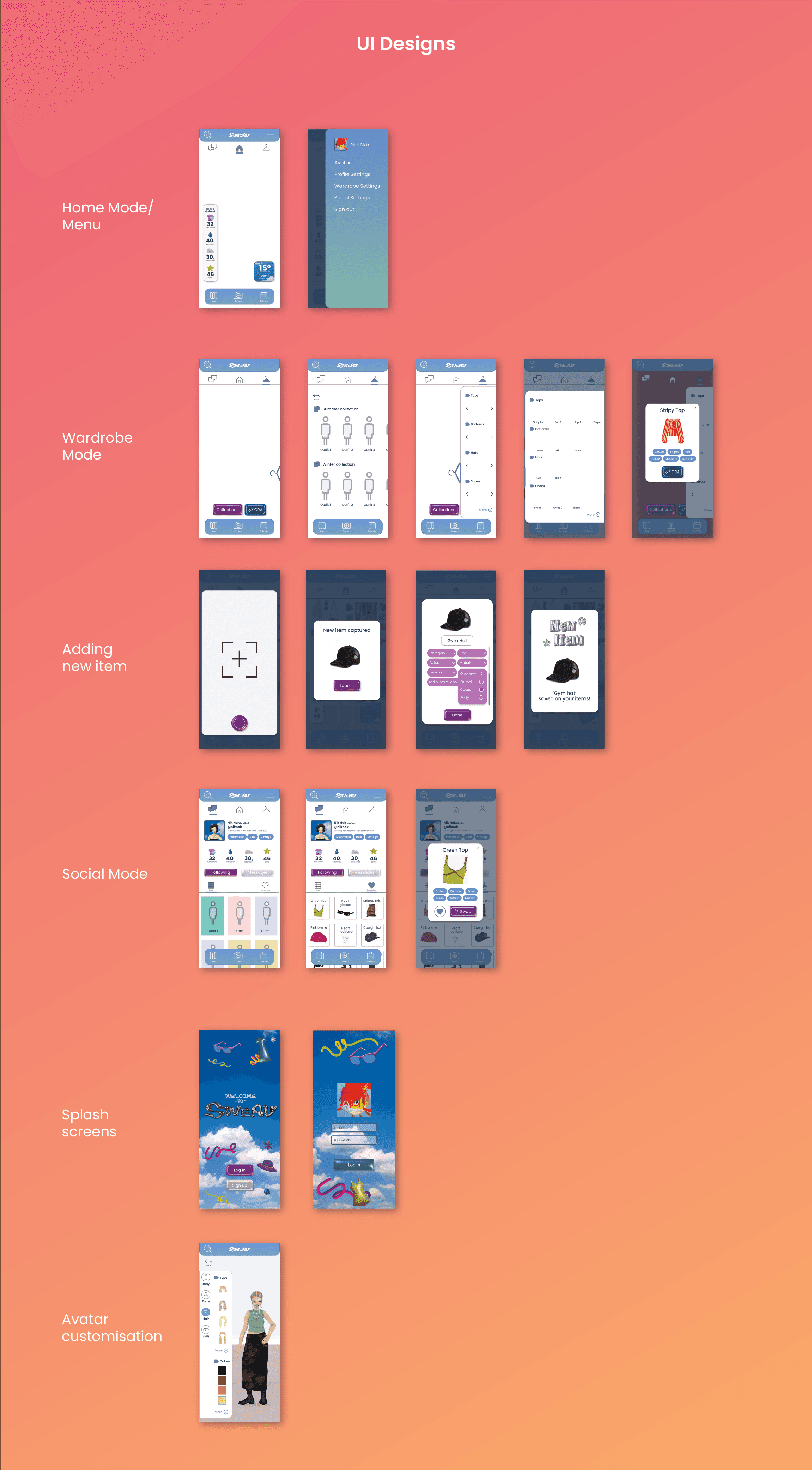
Throughout the user experience, we aimed to keep users aware of their impact on combating fast fashion and climate change. By displaying stats in Home mode such as water saved or carbon emissions reduced prominently on the home screen, we created a point-based system to motivate continued engagement with the app.
The founders aimed to provide users with the ability to customise their avatar to more closely resemble their own features, helping them visualise how outfit combinations would look on their bodies.
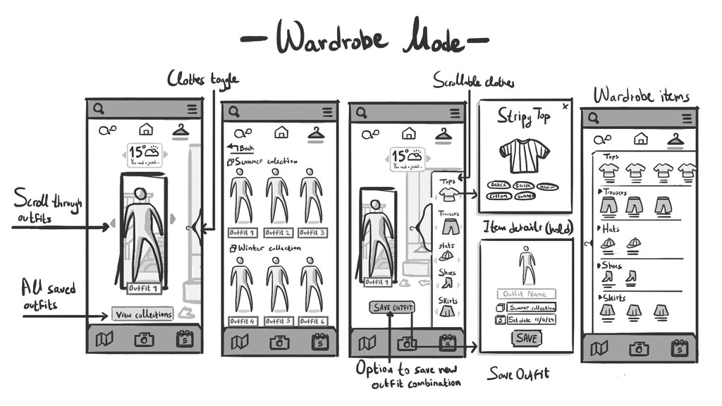
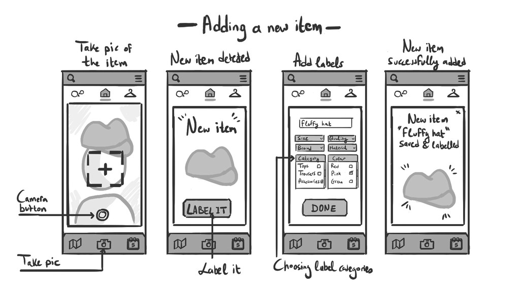
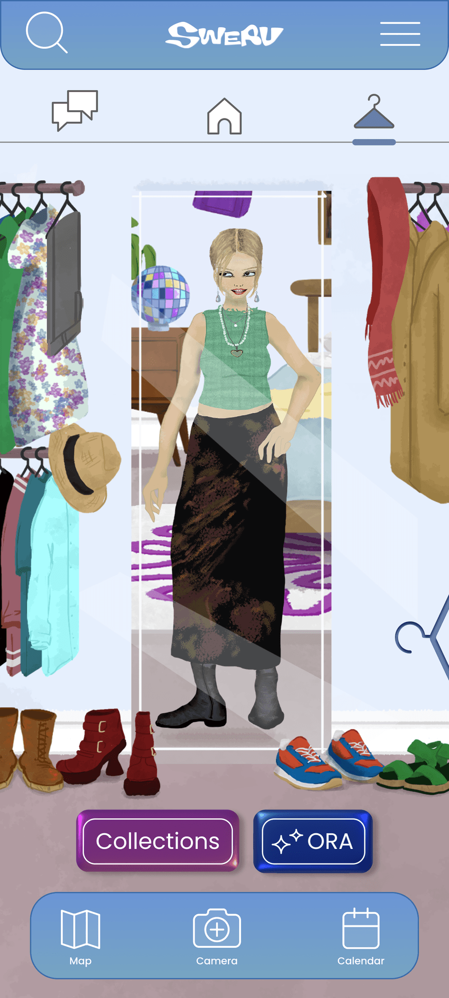
In Wardrobe mode, our goal was to create an intuitive experience that allows users to effortlessly browse their current clothing items, label and categorise them, and easily add new pieces by snapping a quick photo. They can view their digitalised wardrobe and outfit combinations displayed on their customised avatar.
Users can also take advantage of ORA (Outfit Recommendation Algorithm), Swerv’s AI-powered tool for instant outfit suggestions.
In Social mode, users can engage with Swerv’s community by sharing their outfits to highlight their style and swapping items with others, promoting a culture of sustainability through sharing and reuse.
Illustrations
Using a digital drawing tablet and Photoshop, I illustrated the environments showcased on the app, like on the Home mode and Wardrobe Mode. The founders wanted the avatars to be set in a familiar environment, such as a bedroom—a space naturally associated with getting dressed.
Collaborating with another illustrator, we designed the avatars inspired by characters from early 2000s PC games, offering a range of facial features for users to choose from. Building on the female avatar design as a foundation, we created the male avatars, with plans to expand customizable features further in the future.
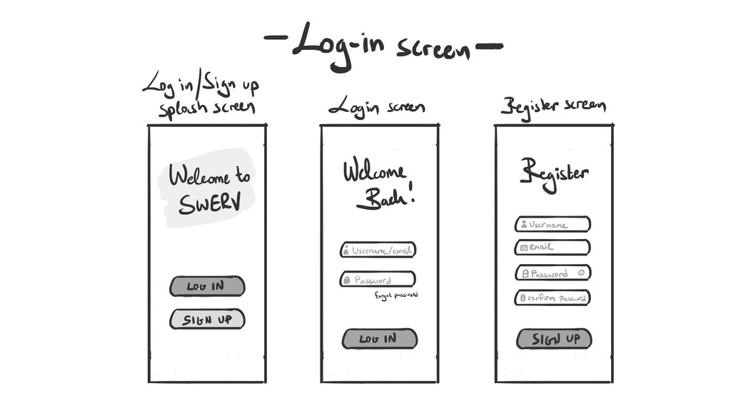
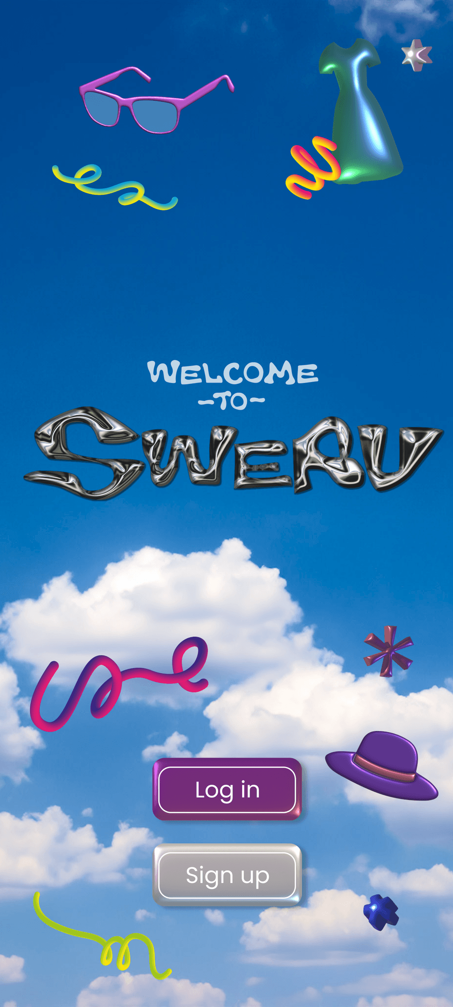
To align with the app’s retro aesthetic, I used Adobe Illustrator to create 3D-style elements for Swerv’s splash screens, including the welcome and sign-up pages.
Using a digital drawing tablet and Photoshop, I illustrated the environments showcased on the app, like on the Home mode and Wardrobe Mode. The founders wanted the avatars to be set in a familiar environment, such as a bedroom—a space naturally associated with getting dressed.
Collaborating with another illustrator, we designed the avatars inspired by characters from early 2000s PC games, offering a range of facial features for users to choose from. Building on the female avatar design as a foundation, we created the male avatars, with plans to expand customisable features further in the future.
To align with the app’s retro aesthetic, I used Adobe Illustrator to create 3D-style elements for Swerv’s splash screens, including the welcome and sign-up pages.
Using a digital drawing tablet and Photoshop, I illustrated the environments showcased on the app, like on the Home mode and Wardrobe Mode. The founders wanted the avatars to be set in a familiar environment, such as a bedroom—a space naturally associated with getting dressed.
Collaborating with another illustrator, we designed the avatars inspired by characters from early 2000s PC games, offering a range of facial features for users to choose from. Building on the female avatar design as a foundation, we created the male avatars, with plans to expand customizable features further in the future.
To align with the app’s retro aesthetic, I used Adobe Illustrator to create 3D-style elements for Swerv’s splash screens, including the welcome and sign-up pages.
Rebrand
In my expanded role as Creative Consultant, I focused on further strengthening Weaving Change’s brand. The challenge was to honour Weronika’s original vision while gradually introducing new ideas on how the brand could evolve, without undermining her core concept.
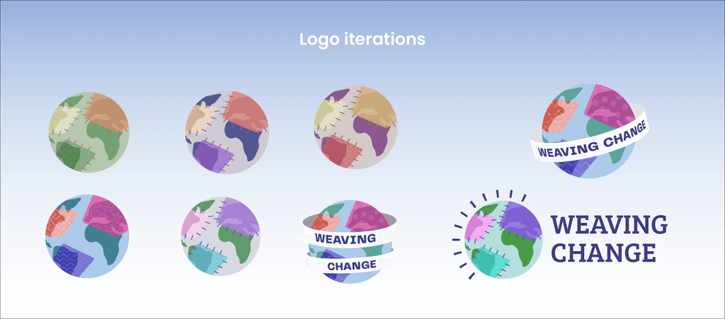
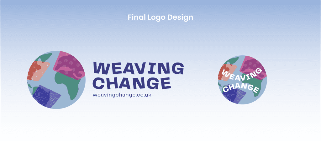
The existing logo, designed to resemble a globe with stitched patterns, had a great concept but lacked immediate clarity. I stepped in to refine it, creating a cleaner, more polished version while retaining the original idea.
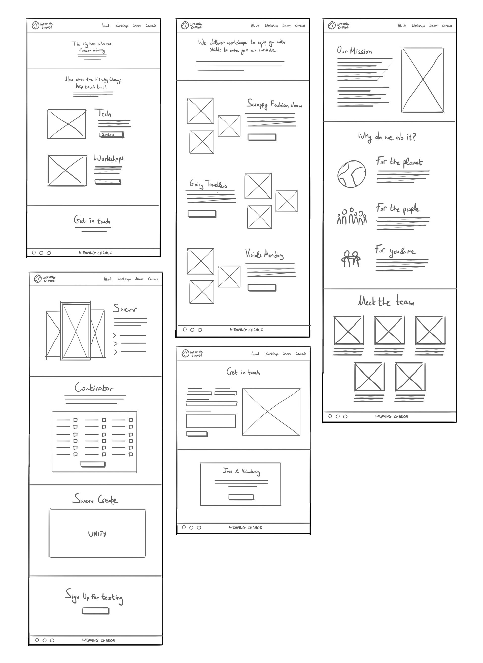
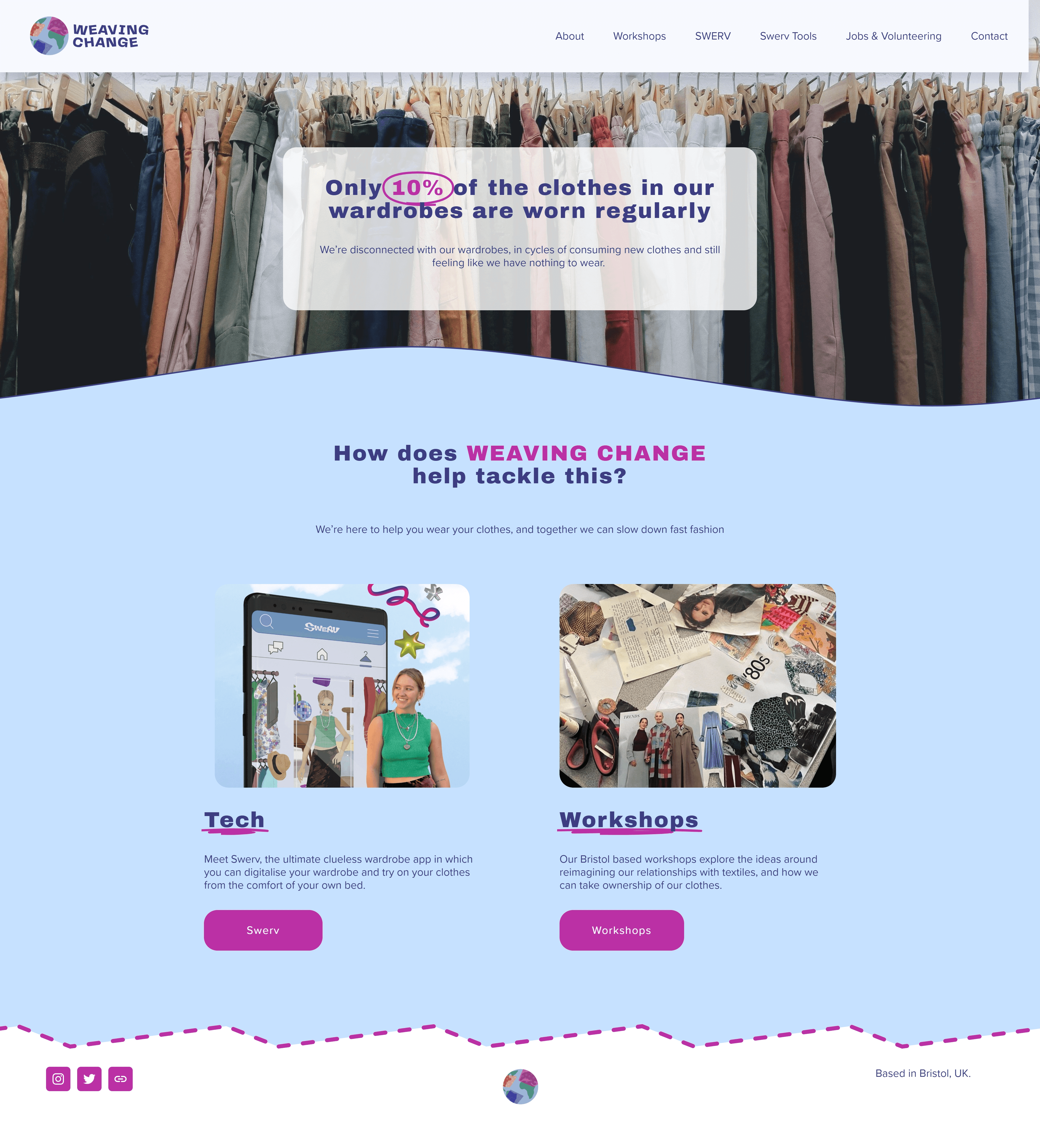
It was important to emphasise the company’s workshops and digital products on the website, while ensuring sustainability remained central to their values.
Additionally, Swerv was positioned as their key offering, with a dedicated page and several mentions throughout the site.
It was important to emphasise the company’s workshops and digital products on the website, while ensuring sustainability remained central to their values.
Additionally, Swerv was positioned as their key offering, with a dedicated page and several mentions throughout the site.
It was important to emphasise the company’s workshops and digital products on the website, while ensuring sustainability remained central to their values.
Additionally, Swerv was positioned as their key offering, with a dedicated page and several mentions throughout the site.
Marketing
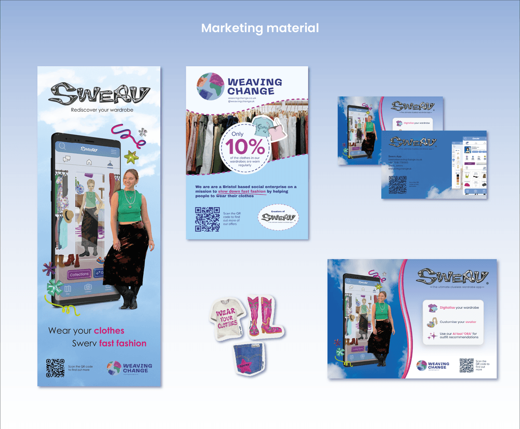
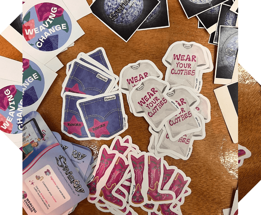
My next task was to create marketing material for showcases and promotional events. I designed roller banners, flyers, business cards, and illustrated stickers, all of which helped the brands stand out, especially at tech-focused events. The brand received positive feedback from the audience and sparked excitement for the upcoming launch of the Swerv app.
My next task was to create marketing material for showcases and promotional events. I designed roller banners, flyers, business cards, and illustrated stickers, all of which helped the brands stand out, especially at tech-focused events. The brand received positive feedback from the audience and sparked excitement for the upcoming launch of the Swerv app.
Impact
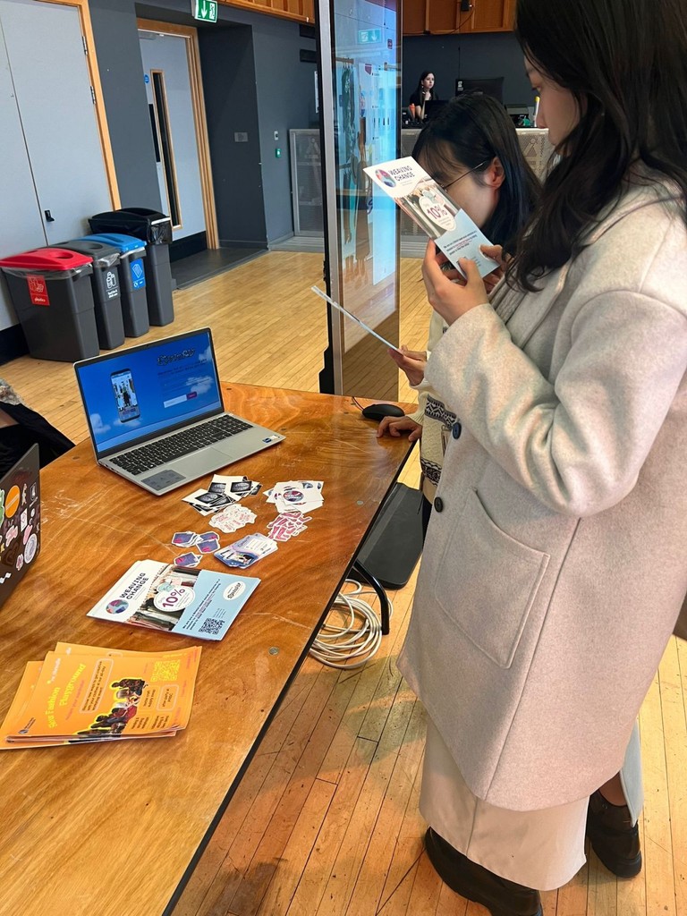
With Swerv's interface designs and Weaving Change’s finalised identity, the founders gained confidence in showcasing their brand at events, attracting increased public interest ahead of the app's launch.
Additionally, the designs provided strong supporting materials for grant applications, which were crucial for funding the app's maintenance and future development.
Takeaways
My time with Weaving Change served as a strong entry point into the world of product design. I embraced the opportunity to not only enhance my skills in user interface design but also closely interact with developers and gain a deeper insight into their unique challenges and work methods. My key takeaways were the following:
🤝 Empathy as a tool for design
I extended my empathy beyond just the user’s needs and challenges. In this case, working closely with Weronika, I had to understand and connect with her vision for the Swerv app, ensuring I remained true to her dream while applying design principles.
✨ Roles can evolve
I joined the project with the prospect of focusing on UI design but that quickly changed. In the start-up world, multi-skilled professionals are highly valued. With over a decade of experience in the creative industry, my role at Swerv expanded in various directions. I embraced the opportunity to apply my skills in multiple areas, helping to shape the app, the brand, and ultimately, Weronika’s vision for a product that she strongly believes in.
This project is close to my heart. It pushed my design skills in new directions and ignited a passion for roles where I can apply my diverse talents to projects that align with my values. It opened my eyes to the importance of being multi-faceted in a world that often tries to box you in.
Thank you for taking the time to read through my case study! 🤝
